You've now had an introduction to the basic presentational aspects that you can modify with CSS rules. Let's return to the initial webpage example to see those CSS rules all together in one project.
<!DOCTYPE html PUBLIC "-//W3C//DTD XHTML 1.0 Strict//EN"
   "http://www.w3.org/TR/xhtml1/DTD/xhtml1-strict.dtd">
<html>
   <head>
      <title>Visit the Duke Gardens</title>
      <style type="text/css">
      </style>
   </head>
   <body>
   <!-- My title/image combination -->
   <div id="top">
      <h1>The Duke Gardens</h1>
      <img src="./pictures/popup_photo_pergola.jpg" />
   </div>

   <!-- 3 paragraph description -->
   <p>
      One of the most beautiful locations on Duke's campus is the Duke
      Gardens.From open areas to picnic or play games, to secluded regions
      for walks through the woods, the Gardens have much to offer any visitor.
   </p>

   <p>
      Though spring and summer certainly bring out the best in the Gardens'
      plants, beauty can be found throughout the year.  More than a simple
      display of flowers,the Sarah P. Duke Gardens include a wide range of
      trees, bushes, and shrubs.
   </p>

   <p>
      In addition to the beautiful scenery, the Gardens are also home to many
      different animals.  Along with the typical squirrels and birds found
      in most woodland settings, visiting the Gardens' ponds also will find
      ducks, geese, turtles, and - of course - fish. The spring and summer
      tradition of the baby ducklings following their parents around the
      Gardens is enough to make visiting the Sarah P. Duke Gardens a tradition
      of your own.
   </p>

   <!-- A simple table of pictures -->
   <h2>More Garden Photos</h2>
   <table>
      <tr>
         <td><img src="./pictures/popup_photo_gate_house.jpg" /></td>
         <td><img src="./pictures/popup_photo_goldfish_pond.jpg" /></td>
      </tr>
      <tr>
         <td><img src="./pictures/popup_photo_sunahama_to_ishi.jpg" /></td>
         <td><img src="./pictures/popup_photo_bird_watching_shelter.jpg" /></td>
      </tr>
   </table>

   <!-- Links to more information -->
   <h2> Find Out More </h2>
   <ul>
      <li><a href="http://www.duke.edu">Duke University</a></li>
      <li><a href="http://www.hr.duke.edu/dukegardens/dukegardens.html">Gardens</a></li>
      <li><a href="http://www.hr.duke.edu/dukegardens/visitor_info.htm">Visitor Information</a></li>
   </ul>
   </body>
</html>
Now we're ready to turn that HTML code into a nice looking webpage. For
this example I'm using an inline style sheet so my CSS rules
will go inside of the <style> element, which is
placed inside the <head> element.
<style type="text/css"> /* CSS Here! */ </style>
For my first CSS rule I'll start out basic by changing the color of the text in my paragraphs, like so:
p { color: #115511; }
Again, this CSS rule sets all of the text inside <p>
elements to be a green-ish color, given by the RGB value #115511. Since
this webpage is about gardens maybe this green text color will make sense.
In addition to changing the text color, we might also like to change its size. This is done with the font-size property.
p {
   color: #115511;
  font-size: 0.8em;
}
To review, for the font-size property we give it the value we want for the height of the text. The units for the value above are em, which you can think of as a percentage of the default size the text would normally have. In the case above 0.8em corresponds to 80% of normal text height. If we want to be more exact we can use px for pixel units. This will set how many pixels tall the text will be.
For our paragraph elements we might also like to change the text-indent and text-align properties. The text-indent property merely states how far in the first line of text is indented. We can use this property for the text in any HTML element, not just paragraph elements. Similarly, the text-align property sets whether the text is pushed to the left, right, is centered, or is justified. Justified simply means that the text is spaced to fill all of its available space on each line (to give straight-line margins on both sides).
p {
   color: #115511;
   font-size: 0.8em;
  text-indent: 1.5em;
   text-align: justify;
}
One more thing for changing text: the font family. Until now your webpages have probably been using the default text font that a web browser will give it. Any simple HTML webpage will do this. So, a good way to make your webpage stand out is to use the font-family property to change the font of your text. Remember that it's possible that not all computers that view your site will have your favorite font. So, you can give the font family values as a list of preferred choices. The last choice should probably be either serif or sans-serif to say if you want any font that adds details to the tips of letters (like Times) or a sans-serif one without those details (like Arial).
body { font-family: arial, sans-serif; }
Finally, while the sans-serif font looked good for the small text, for my larger text in the header elements I'm going to put a serif font back in. I can do this for the <h1> and the <h2> elements at the same time with a single rule. I can target as many HTML elements as I like in a given rule, I just have to separate them with commas.
h1, h2 { font-family: times, serif; }
Before going further, here's my CSS code and the basic look of my page so far:
<style type="text/css">
body { font-family: arial, sans-serif; }

h1, h2 { font-family: times, serif; }
p {
   color: #115511;
   font-size: 0.8em;
   text-indent: 1.5em;
   text-align: justify;
}
</style>
Still to be added...
With the color and formatting of my basic text figured out, I'm now ready for some broader changes involving the margin, border, and padding around my elements. Remember the box model that defines these areas:
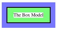
In the example above, the white area represents the space taken up by just the text in an HTML element. Around the text, the green area gives the padding area around the text. Outside of that we have the border of this HTML element. Finally, the blue area gives the margin space around this HTML element. By default, other HTML elements will not overlap any of these spaces.
In the CSS code below I'm setting the top and left borders around my HTML body element. A single rule, such as that for the border-top property, gives the border thickness, it's look (solid, dashed, dotted, etc.) and finally its color.
body {
   font-family: arial, sans-serif;
  border-top: 5px solid #337733;
   border-left: 7px solid #337733;
}
After setting the border of just the top and left sides, I'm now going to set the padding area width on all sides. Since I'm going to set the same padding width on all sides, it's easier to do this with a single rule, modifying the padding property, rather than 4 separate rules for padding-top, padding-left, padding-bottom, and padding-right.
body {
   font-family: arial, sans-serif;
   border-top: 5px solid #337733;
   border-left: 7px solid #337733;
  padding: 1em;
}
So far all of the HTML elements are layed out in the basic top-down way. I'm now going to change that for a couple of my top elements. Typically, HTML elements are either have a block display or an inline display. A block display element is put on its own horizontal line, while a single line will take as many inline elements as will fit. We can change the display type of any HTML element with the display property, which you would you could then give the value block or the value inline.
Another display change you can make, and one we'll make in this example webpage, is to turn on the float property. This takes an HTML element out of the normal top-down flow and floats it in a certain direction. If you give it the value left the element will float to the left side, while a value of right will send it to the right side. Another nice aspected of floated elements is that other elements will tend to flow around the floated element. We see that affect here with my paragraph text flowing around my title image (if there's room beside the image).
In the line of code below, I'm going to float my div element to the left. A div element is a great way to put a container around several other HTML elements. In this case, my top h1 element and my top img element were contained in a single div element. The span HTML element has the same effect, but by default a div element has block display while a span element has inline display.
div#top { float: left; }
Last thing on the above CSS rule: the #top part is referencing the id value I gave to the div element. An id is just another attribute you can add to any HTML opening tag. It gives you a way to specifically identify one HTML element rather than all instance of one type of HTML element.
One more change I'll make is for the position property. By setting the position to absolute I can position the element exactly where I want. Other options would be values of relative, static, or fixed.
h1 { position: absolute; }
I'm also going to set the background-color property so that this h1 header will have a dark background. Then I give it white text to make it stand out.
h1 {
   position: absolute;
  color: #ffffff;
   background-color: #337733;
}
I'm now setting the top and left margins to get the element positioned where I want.
h1 {
   position: absolute;
  margin-left: 5em;
   margin-top: 0.1em;
   color: #ffffff;
   background-color: #337733;
}
Now, a little bit of padding is put in around the text in this header to make it easier to read. In this case I'm using a single rule to set the padding widths for all 4 sides of my element, but I can give a different value to each side. This is done by giving 4 values which, in order, will set the padding for the top, right, bottom, and left sides of the element.
h1 {
   position: absolute;
   margin-left: 5em;
   margin-top: 0.1em;
  padding: 0 0.3em 0 0.3em;
   color: #ffffff;
   background-color: #337733;
}
As one last thing for this header element, I'm giving it a dark left and bottom border to help separate it from the image that it's overlapping.
h1 {
   position: absolute;
   margin-left: 5em;
   margin-top: 0.1em;
   padding: 0 0.3em 0 0.3em;

  border-bottom: 2px solid #000000;
   border-left: 2px solid #000000;
   color: #ffffff;
   background-color: #337733;
}
Once more, before moving on let's check what our total CSS code looks like and what it's done to our HTML content so far. The new CSS code is given in red.
<style type="text/css">
body {
   font-family: arial, sans-serif;
  border-top: 5px solid #337733;
   border-left: 7px solid #337733;
   padding: 1em;
}
div#top { float: left; }
h1, h2 { font-family: times, serif; }
h1 {
   position: absolute;
   margin-left: 5em;
   margin-top: 0.1em;
   padding: 0 0.3em 0 0.3em;

   border-bottom: 2px solid #000000;
   border-left: 2px solid #000000;
   color: #ffffff;
   background-color: #337733;
}
p {
   color: #115511;
   font-size: 0.8em;
   text-indent: 1.5em;
   text-align: justify;
}
</style>
Still to be added...
A very noticable problem in my webpage so far is that the images below in my table are much larger than I'd like. I can use either the height property or the width property (or both) to set them to a better size. I can target just the images in the table (and not my top image) by stating in the rule that I want to look for a table HTML element and then any img element within a table.
table img { height: 150px; }
Since I only specified the height of the HTML element above, the width will automatically resize to "match". Here that means it will resize the image to keep the same height-to-width ratio that the image had originally. Next, just a small border around the table to (hopefully) make it look nicer.
table { border: 1px solid #337733; }
Also, some color and padding to make my h2 headers fit in better.
h2 {
   color: #003300;
   padding-left: 1em;
   border-bottom: 1px solid #337733;
}
The paragraph text in my document looks good wrapped around my <h1>
title and my top image. However, the <h2> header immediately
following that probably should not be put beside that top
photo. So, I can set the clear property to have those
HTML element clear anything that was floated left,
right, or left and right (using the both property).
h2 {
   color: #003300;
   padding-left: 1em;
   border-bottom: 1px solid #337733;
  clear: both;
}
Once again, it's time for an updated look at my CSS code and it's resulting webpage. New CSS code is given in red.
<style type="text/css">
body {
   font-family: arial, sans-serif;
   border-top: 5px solid #337733;
   border-left: 7px solid #337733;
   padding: 1em;
}
div#top { float: left; }
h1, h2 { font-family: times, serif; }
h1 {
   position: absolute;
   margin-left: 5em;
   margin-top: 0.1em;
   padding: 0 0.3em 0 0.3em;

   border-bottom: 2px solid #000000;
   border-left: 2px solid #000000;
   color: #ffffff;
   background-color: #337733;
}
h2 {
   color: #003300;
   padding-left: 1em;
   border-bottom: 1px solid #337733;
   clear: both;
}

p {
   color: #115511;
   font-size: 0.8em;
   text-indent: 1.5em;
   text-align: justify;
}

/* Making the table images the right size. */
table img { height: 150px; }
table { border: 1px solid #337733; }
</style>
Still to be added...
Now for my list of links at the very bottom of the page. Using the list-style-type property I can set each list entry to be numbered, to have circle bullet points, square bullet points... or nothing at all. "Nothing" is what I'm choosing here. I'm all using a little padding to give my list some space.
ul {
   list-style-type: none;
   padding-left: 0.5em;
}
A list doesn't always have to be vertical. Here I'm changing the display property of the list elements with the value of inline so the list elements are given horizontally. Next, a thin border around those list elements helps make them stand out.
li {
   display: inline;
   border: 1px solid #000000;
}
We're almost done. For my links contained inside the list entries I'm going to remove the underline with the text-decoration property. Then I put in a little bit of padding to make the text easier to read and change the color to match the rest of my green-ish page.
a {
   padding: 0 10px;
   text-decoration: none;
   color: #337733;
}
Last thing: I want my links to change styles when the mouse
"hovers" over them. So, I'm using the hover
pseudo-class. This set of CSS rules will only be applied
to <a> anchor elements that have a mouse pointer hovering
over them.
a:hover {
   color: #ffffff;
   background-color: #337733;
}
That completes the CSS code for modifying this example webpage!